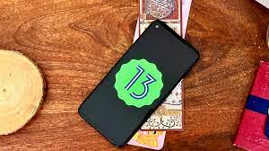
After months of testing, Google has finally unleashed Android 13, its current Android smartphone update for 2022. As far as updates go, it’s not one that you’ll notice. I’ve been using Android 13 for around two months prior to its release, and it’s been a pretty whelming experience.
Unlike iOS 16, which is a large and hefty update, Android 13 is rather pedestrian. There’s not much differentiating it visually or functionally from previous Android releases. Much of what sets Google apart from Apple on this front is that Apple frontloads all its significant app improvements into its big iOS releases. Google trickles its features out as soon as they’re ready, so many features announced with Android 13 — like a revamped Google Wallet and tablet-optimized apps — have already landed. Because of that, Android 13 is an update that’s barren of excitement.
The result is an update devoid of anything too flashy or superfluous. But considering how good Android 12 was, the decision to focus on refinement instead of another overhaul was the right call to make.
Changes so subtle you may not notice them
If iOS 16 changes how your iPhone works in big ways, Android 13 is far more subtle than that. Take Material You, debuting in Android 12. That update revamped how you could use your Android phone and enhanced its customizability. It gave Android, for the first time, a strong sense of being designed rather than engineered. You’d get colorful themes that bled into Google’s apps and pulled from your wallpaper, giving your phone an additional layer of personalization.
Google has improved this in Android 13 in a few key ways. You’re getting a much larger spread of color options, with some colors now being richer and more colorful and others ranging more pastel. It adds variety to Material You’s colors, though you’re still unlikely to see it inside your apps of choice. Speaking of apps of choice, Material You also works with more app icons.
Remember that themed icons feature that Google introduced with Android 12? It wasn’t very useful, with only Google’s apps supporting it, but now the company’s lifting that artificial limitation. More and more apps can use themed icons now. Big name apps have jumped on, including Meta’s WhatsApp, Reddit, and Pocket. That’s a good sign. Perhaps apps like Spotify and Messenger will follow, allowing Android 13 owners greater flexibility over icon design.
There’s also a newly redesigned music player in the notification center that adds a splash of color to it and an editable clipboard — and that’s about it for general user-facing features. There are more Android 13 features, and they are useful, but they’re also specialist features aimed at a specific audience.
Android 13’s most useful features are its most limited
Google now allows for multi-language support in apps, separating your main Android language from the languages that are used by select apps. This allows you to have your Android phone set up in French, while your banking app is in Spanish, for example. Or, you can opt to use Telegram in Russian and WhatsApp in Italian, just to use another example. If you’re multilingual or live in a multilingual country, you can quickly see the value of this. If you’re not, you can probably still see the value of it, but you’ll be unlikely to appreciate it.
The same applies to both enhanced Chromebook integration and tablet updates. With Android 13, Google is getting better at working with your Chrome OS device. You’re going to be able to stream messaging apps over to Chromebooks through an extension to its Phone Hub feature. This comes in addition to supported services, including quicker photo sharing, an AirDrop-Esque Nearby Sharing feature, and more. If you’re one of the relatively few people with a Chromebook, this could be immensely useful. If you’re not, well, the same goes.
A forgetful, important update
Android 13 is a pretty competent update. It goes around the system fixing things that work, tightening things that needed righting, and adding new features that fans requested, but it’s not a revolution in how you use your phone. In fact, unlike Android 12, once you download it, you’ll quickly forget that you’re using a new operating system.
Whether that’s good or bad is up to you. Android has matured — and that’s for the best. Android 12 took the OS in a bold new direction. Android 13 retains almost all of those decisions and focuses on refining them to make them as good as can be. An exciting update Android 13 is not, but a good one? Absolutely.


