It looks Awesome, with a capital A
The way Android looks has changed drastically over the course of the last few years. And with Android’s constant changes, its brand identity has also adapted over time. We’ve seen a few changes to Android’s logo and brand identity over the years, with the bugdroid remaining a staple of Android’s brand. The last change was in 2019, and saw Google use only the bugdroid’s head in addition to a slightly refreshed font. We’re used to getting a logo change every few years or so, and if you were worried Google was going to settle for what it has right now, it’s not happening. Google is yet again redesigning Android’s brand — and this time, it’s going for a rather radical one compared to what we’ve seen before.
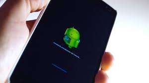
Android is getting a new logo that’s meant to bring the Android brand to the 2020s (via 9to5Google). That bugdroid head is staying, but now, it’s not a reduced flat shape anymore. Instead, it’s 3D-looking for a change, with shadows and light reflections on it. It’s similar to the current robot head, but it manages to stand out way better with the new effects.
The other big change is in the typography. While Android has historically had a lowercase logo since 2008, this new logo is using a capital A for a change rather than being completely lowercase. The font itself also looks slightly changed, but frankly, what you’re probably going to notice straight away is that new capital A.
Google has been flirting with this new 3D droid ever since CES 2023 rolled around, although it was still shown alongside the older Android typography. It made yet another appearance during I/O 2023. Now, the new logo showed up in an ad for Android and Google apps on the Samsung Galaxy S23 Ultra and Flip 4. In a statement to 9to5Google, Google said the following, confirming the new change in brand identity:
We’re showcasing some elements of our new brand identity on various surfaces, including our CES booth from earlier this year and other campaign materials like digital & banner ads. We’ll have more to share in the coming months.
I’m not going to say that it looks bad, but seeing as I’ve grown used to seeing that lowercase Android logo for more than a decade, it’s definitely looking a bit out of place. Maybe it’ll grow on me, though. Who knows.


